Client-First Template 1
August 15, 2025 by Mark-Luigi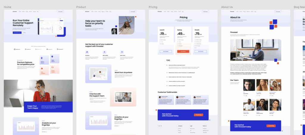
Figma Design: https://www.figma.com/community/file/1020702273348701758/client-first-template-1
Live Site: https://finsweet1.markluigibatoctoy.com/
I recently explored Finsweet’s Client-First template and applied it to a live build—creating a polished, scalable site with 10+ pages (including Home, Product, Pricing, About, Blog, and more). This exercise deepened my understanding of organized Webflow development, and it sharpened my workflow. Below, I’ll walk through what I learned and what I worked on, highlighting key insights for anyone interested in structured Webflow builds.
What I Learned
1. The Client-First Approach
The Client-First system focuses on building websites that are clear, scalable, and easy to maintain. The structure is designed so that any designer, developer, or client can quickly understand and manage the project.
2. Clear and Organized Structure
Every page follows a consistent layout framework, making it easy to keep designs aligned and visually balanced. This consistent structure also helps when scaling up to larger projects.
3. Consistency in Design
Typography, spacing, and colors are applied using a predefined style system. This ensures every element feels part of the same design family, improving both the visual quality and the user experience.
4. Responsive Design Best Practices
The template is built with responsiveness in mind, so layouts adapt beautifully across desktop, tablet, and mobile devices. I gained a better understanding of how to manage spacing, stacking, and scaling for different screen sizes.
5. Project Organization
The system organizes content in a way that makes it easy to navigate the project. This not only saves time but also helps ensure that updates and changes can be made quickly without affecting other areas of the site.
6. Accessibility and Readability
By following best practices for sizing and spacing, the design remains easy to read and navigate for all users, which is an important part of creating inclusive websites.
What I Worked On
1. Setting Up the Template
I started by familiarizing myself with the template’s structure and layout system, understanding how the sections, containers, and spacing were applied throughout the pages.
2. Building Core Sections
I customized the home page, creating a strong hero section, feature highlights, and call-to-action areas that clearly communicate the brand’s value.
3. Ensuring Consistent Styling
I applied the template’s style rules across all sections, ensuring the same design language was maintained from page to page.
4. Making It Responsive
I refined the layout for mobile and tablet views, ensuring that the design remained visually appealing and easy to navigate on all devices.
5. Organizing the Project
I kept the project well-structured so that any future updates—whether adding a new section or adjusting a design element could be done smoothly.
6. Creating the Blog Layout
I built and styled the blog listing and individual post pages, keeping the look and feel consistent with the rest of the site while maintaining a clear reading experience.
Key Takeaways
- A well-structured template saves significant time during development.
- Consistency in design creates a better user experience.
- Organized workflows make projects easier to maintain in the long term.
- Responsive design principles are essential for modern web projects.